Tutorial (1 / 5)
We have developed a visualization -- called the Bicentric Diagram -- to simultaneously depict sets, tiers, and network connections of two focal entities. There are numerous applications for bicentric diagrams including social networks, supply chains, product reviews, etc. We will provide you with three sample domains (more on that later). Note: The specific domain is not important for this evaluation. We simply ask you to interact with the visualization.
Please click on the [Next] button below to get a brief overview of how to use the visualization.
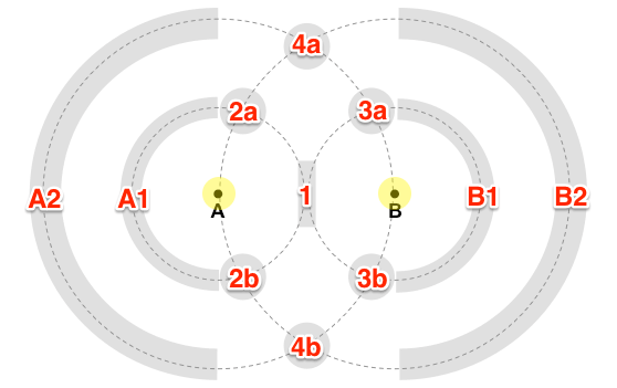
Let's start with an overview of the layout. Take a look at this figure.

- There are two focal nodes A and B positioned at a fixed distance apart.
- Two concentric circles are drawn around each node. Each circle represents a tier of the focal node.
- The arcs and intersection points represent areas where corresponding node sets are placed.
- Those nodes only connected to Node A (or B) directly are placed on the arc [ A1 ] (or [ B1 ]).
Connections to only those nodes are placed on the outer arcs [ A2 ] and [ B2 ]. - Shared nodes are placed at the center. [ 1 ]
- Nodes one step apart from Node A and two steps away from Node B are placed around [ 2a ] and [ 2b ].
We differentiate nodes placed at the top ([ 2a ]) and the bottom ([ 2b ])
by whether they belong to the main component.
We do this to minimize long edges and identify clusters. - Nodes two steps apart from both Node A and B are placed at [ 4a ] and [ 4b ].
The same top ([ 4a ]) and bottom ([ 4b ]) differentiation applies.
Nodes in the top cluster belong to the main component; all others are placed in the bottom cluster.
In this study, we provide three sample datasets for you to explore at your discretion:
- Technology Co-Occurrence: This dataset contains the co-occurrence network of technologies mentioned in the press. A node represents a technology and an edge between two nodes indicates that they were co-occurred in a press release. Nodes are sized by the frequency of occurrences and colored by technology category. Edge thickness corresponds to the total number of co-occurrences between two technologies.
- Institutional Collaboration: This dataset contains the collaboration network of institutions in the ACM Digital Library. A node represents an institution and an edge between two nodes indicates that they co-authored a publication. Nodes are sized by the institution's total publications count and colored by geographic region. Edge thickness corresponds to the total number of co-authored publications between the two institutions.
- Health App Co-Purchases: This dataset contains Android health apps co-purchased on Amazon.com. A node represents a heath app and an edge between two nodes indicates that they were co-purchased. Nodes are sized by the total number of reviews and colored by the health app category. Edge thickness corresponds to how similar the two apps are.

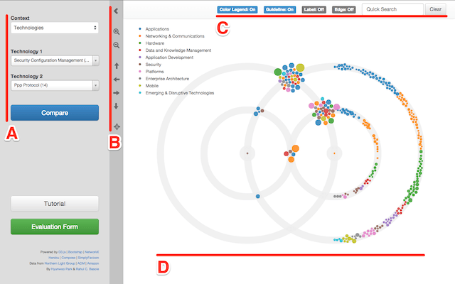
The UI is layed out as follows:
- [ A ] There are two drop down lists that contain the node options for the particular context chosen. The number next to each entry indicates its occurrence frequency. The lists are scrollable and searchable. Once you have selected your two focal nodes of interest, click "Compare". The screen will update the visualization.
- [ B ] Our tool provides several handy tools. You can collapse and expand the visualization window [ and ]. You can zoom in [] and out []. You can also use the mouse scroll bar to do this. You can pan using the arrows [, , , and ] or by click-and-dragging the visualization window. You can also reset [] the visualization to fit the screen.
- [ C ] There are several additional tools. You can show/hide edges. You can also show/hide the layout gridcircles. A color legend is provided by clicking on the color legend. If you need to locate a specific node in the visualization, you can use the quick search box.
- [ D ] This is the visualization pane. Hovering over a node provides detailed information in a label. It also shows its connected edges and nodes (while fading others). Clicking on a node will fix the highlights for convenient tracking. Clicking on the background will cancel the current selection.
That's it!
Choose any context, select two nodes, and start exploring.
After you are done, please click on the green Evaluation Form button to complete a brief survey. We want your input on how well the visualization worked, what you may have learned, and how to improve it. Your response is appreciated.

Thank you.